無論是一般的電腦、電視或者是移動式裝置,我們統稱為 devices(設備),俗稱 3C 產品,在網頁設計的思維上,主要是考慮這些 Devices 螢幕的尺寸大小,也就是電腦、電視、移動式裝置的螢幕尺寸大小。
由 HTML 語法、CSS(cascading Style Sheet)、Javascript 語言撰寫而成的頁面
由許多網頁及一些多媒體的檔案所構成的網頁架構,網站的第一個頁面稱為首頁,首頁的檔名通常是 index.html, index.htm, index.asp, index.php, index.aspx
主要是提供網頁製作者存放他們製作的網頁或網站的一種軟體,例如: IIS, Apache HTTP Server ("httpd"), nginx, lighttpd 等
URL 俗稱是網址,網址是一個網站的位址,例如;臺中科技大學的網址是 www.nutc.edu.tw,Yahoo 的網址是 www.yahoo.com.tw
Uniform Resource Identifier 的縮寫,語法: resource_type://hostname:port/filepathname?query_string#anchor
http://www.ntu.edu.tw/
http://www.ntu.edu.tw/index.html
http://www.ntu.edu.tw:80/index.html
http://www.nutc.edu.tw/cat/index.html

文字編輯器(Text Editor)、所見及所得(What You See Is What You Get, WYSIWYG)

開啟新檔(New File): Ctrl + n
儲存檔案(Save): Ctrl + s
複製(Copy): Ctrl + c
剪下(Cut): Ctrl + x
貼上(Paste): Ctrl + v
全選(Select All): Ctrl + a
單行選取(Select Line): Ctrl + L
回復(Undo): Ctrl + z
重作(Redo): Ctrl + y
搜尋是使用電腦最常用、重要的功能,在開啟瀏覽器、編輯器或其他軟體,找尋資料可以按下: Ctrl + F,搜尋目前文件內部的資料,如同使用 Google 輸入關鍵字搜尋資料一樣。
搜尋大家都知道,也曾經使用過,但是,在 Google 搜尋,顯示搜尋結果以後,你/妳還會再按下 Ctrl + F 繼續搜尋嗎?
Choose from the large selection of latest pre-made blocks - full-screen intro, bootstrap carousel, content slider, responsive image gallery with lightbox, parallax scrolling, video backgrounds, hamburger menu, sticky header and more.
Sites made with Mobirise are 100% mobile-friendly according the latest Google Test and Google loves those websites (officially)!
Mobirise themes are based on Bootstrap 3 and Bootstrap 4 - most powerful mobile first framework. Now, even if you're not code-savvy, you can be a part of an exciting growing bootstrap community.
Choose from the large selection of latest pre-made blocks - full-screen intro, bootstrap carousel, content slider, responsive image gallery with lightbox, parallax scrolling, video backgrounds, hamburger menu, sticky header and more.
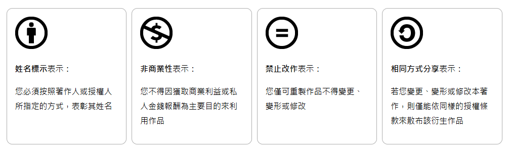
四個授權要素
六個授權要素
OFL: Open Fonts License
英文字體:Google Fonts、Noto Fonts
中文字體 :源樣、源流、源雲字型
思源柔黑體、思源真黑體字型